Driving 16% revenue growth through streamlined navigation and a frictionless checkout in an e-commerce platform.
Pola Club’s store was losing buyers on product pages, cart, and checkout, and nobody knew why. In a one-month sprint, I led three junior designers through research, prototyping, and testing. We found the causes: unclear film compatibility, a checkout form that erased data after one error, and a login redirect that emptied the cart.
- Company
Pola Club
- Platform
B2C, E-commerce
- my role
Lead UX Designer
- Team
- Key Stakeholder
- 3 Junior UX/UI Designers
- Myself
- Timeline
October 2024
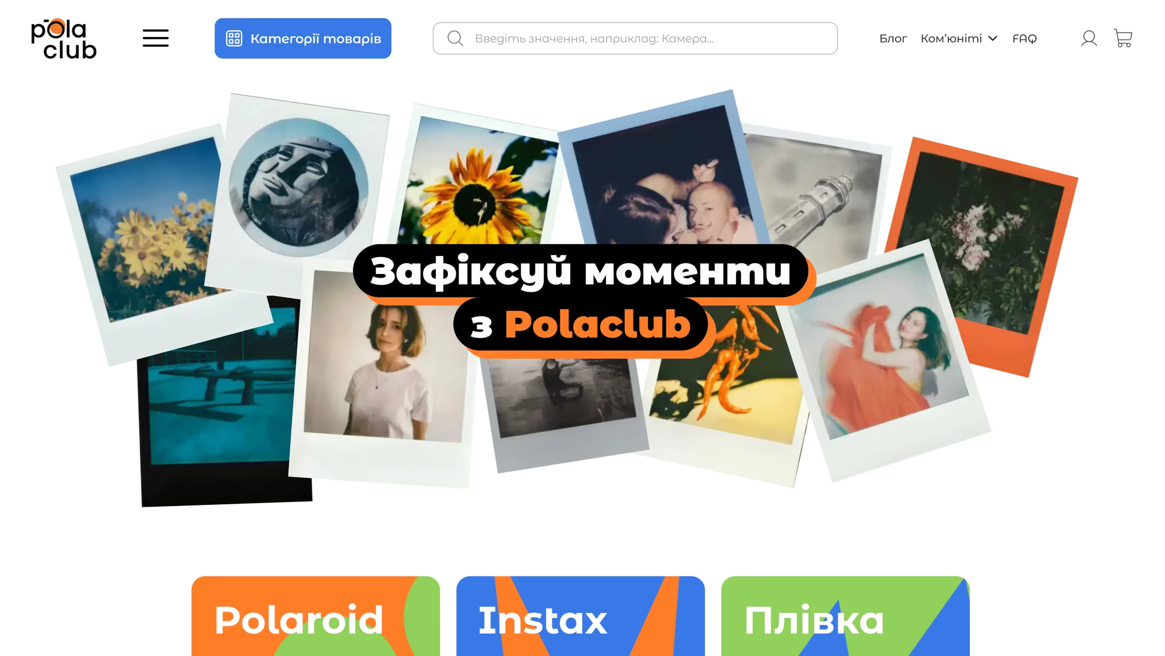
About Pola Club:
Pola Club is a growing online retailer for instant cameras, film, and accessories. Adopting a rapid-launch strategy, the business planned to identify and resolve interface vulnerabilities post-launch based on real user feedback and analytics. While stakeholders knew the sales funnel was leaking, they needed UX expertise to uncover the root causes and fix the core flow to support business growth.
My Role & Scope of Work
As the lead designer, I focused on researching and designing key stages of the funnel that had the greatest potential for improving business metrics specifically: search, filters, product pages, and the new step-by-step checkout process (all of which are described below, except for the product comparison feature, which was developed by another team member). While our design team concurrently tested other hypotheses, this case is solely focused on those interface solutions that directly contributed to revenue growth and reduced cart abandonment rates.
The Challenge
Despite operating in a booming market, the website was losing sales due to several critical roadblocks:
- Massive drop-offs: analytics showed significant user losses at every stage of the sales funnel, with the most severe drop-offs occurring specifically on the product pages, cart, and checkout stages.
- The hidden root cause: the business didn't know why users were abandoning their journeys. Our UX research revealed that buyers were deeply confused about film compatibility with different cameras. Furthermore, product descriptions were of poor quality, technical specifications lacked consistency, and critically important information about shipping and payment was completely missing. This caused severe hesitation, especially for new customers.
- A broken checkout flow: The ordering process punished users with long forms and a critical system bug that erased all their data if they made a single mistake.
These usability issues were actively driving potential buyers away. My goal was to fix these broken funnels and design a smooth, intuitive shopping experience to boost conversion rates.
The Results
+16% revenue growth
By implementing optimized UX flows and replacing a confusing legacy navigation system with a unified category structure, I transformed user interest into seamless conversions.
7% reduction in checkout abandonment
By breaking the complex checkout form into logical blocks and independently uncovering a critical login-redirection bug, I streamlined the final purchase steps and protected the conversion funnel.
9% reduction in cart abandonment
We redesigned the product pages to explicitly highlight film compatibility. This empowered users to confidently evaluate technical differences without leaving the platform.
ACCELERATED TEAM VELOCITY
I implemented a Kanban-based Double Diamond framework and facilitated daily stand-ups, eliminating data-handoff bottlenecks and ensuring 3 junior designers hit our strict 1-month deadline.
Research & Discovery
Process & Team Leadership
To build a data-driven solution, I organized a workflow using the Double Diamond framework. Every research phase had a clear goal, not just to gather data, but to equip the team with the actionable insights needed to make the right design decisions.
To ensure speed and quality, we have implemented the following processes:
- Agile Management: I set up a Kanban board synchronized with the timeline of the "Double Diamond" framework. Each stage had clear boundaries and responsible parties, ensuring complete transparency of expectations. Daily stand-ups allowed for immediate identification and removal of blockers.
- Parallel Research: Instead of one person spending weeks on research, we distributed the workload. For example, we divided the list of respondents among team members and completed all 10 in-depth user interviews in just 2 days. At the same time, we conducted desk research in parallel, compiling the results into a single document at the end of each day.
- Co-creation Workshops: We created the most important strategic artifacts together. We collaboratively developed the customer journey map (CJM), hypothesis generation, and survey drafts during facilitated video calls. This ensured a deep immersion of the entire team in the user context.
- Continuous Feedback Loop: The quality of the final design and data was monitored through continuous iterations and my regular feedback (Design QA). This allowed us to move quickly without compromising quality standards.
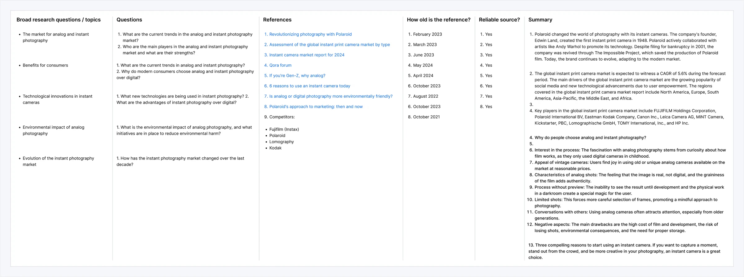
1. Desk Research
Before designing anything, we needed to understand what holds buyers back. Our users are anxious about expensive mistakes, like buying the wrong film or wasting shots, so the new UI had to put buyer confidence first.
Market growth
Steady growth, driven by Gen Z and Millennials who want tangible, authentic experiences.
User motivations
People choose analog for the intentional process (no digital preview) and the film grain look.
Main barriers
High film cost, a learning curve with vintage hardware, and the fear of wasting expensive shots.
2. Competitive Analysis: Finding the UX Gap
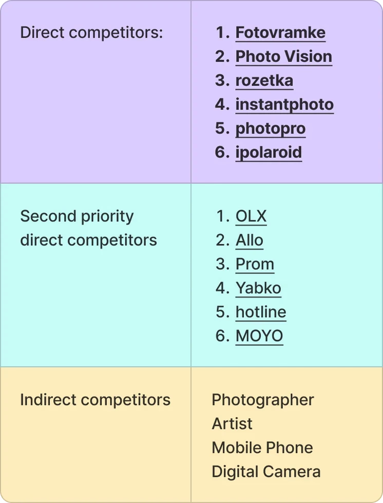
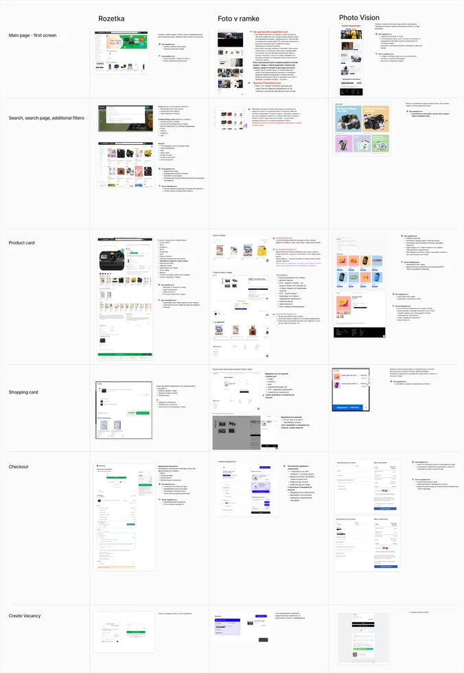
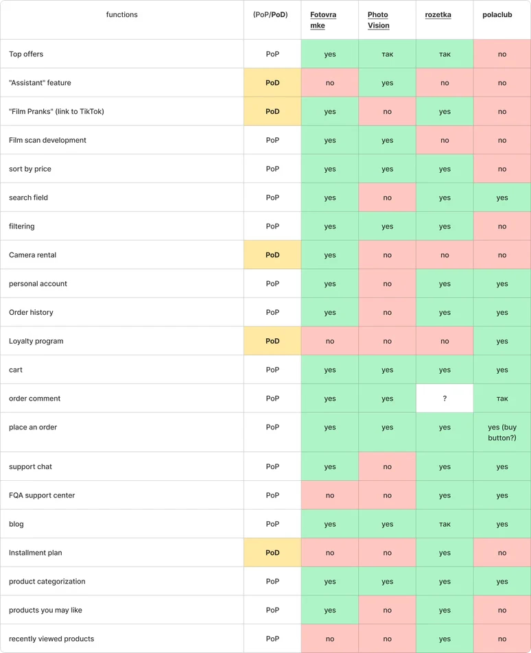
Pola Club couldn't always compete with giant indirect retailers (like Rozetka) on price or physical store presence. We conducted a feature-by-feature UI/UX analysis to find a strategic vulnerability in the market. We discovered a massive "UX Gap": every single competitor suffered from terrible filtering, chaotic categorization, and confusing technical specs. This was our "Aha!" moment—it proved that by building a frictionless, highly informative e-commerce experience, Pola Club could capture significant market share simply by making the purchasing process less stressful.
1. Competitor Strengths vs. Pola Club:
Competitors often won on lower prices and camera rentals. However, Pola Club had a unique foundation for retention: a broader camera selection, an established blog, and a dedicated loyalty program.
2. The Design Opportunity:
Across all platforms analyzed, users were forced to do heavy mental lifting. Basic e-commerce features like robust filtering, clear product categorization, and unified specifications were inconsistent or missing entirely across the industry.
3. User Interviews: Identifying the Friction
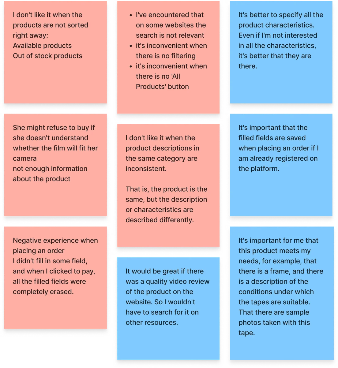
The interviews allowed us to look beyond dry analytics and truly understand why users were abandoning the site. By splitting the user list among the team, we conducted 10 in-depth interviews uncovering several critical issues:
key insights
- Product Discovery: Users complained about irrelevant search results, a lack of convenient filters, and the confusing mixture of in-stock items with out-of-stock products.
- Information Gaps: Users lacked consistent technical specifications that were uniform across all product pages. There were also issues regarding a clear understanding of film compatibility.
- Checkout Frustrations: Users frequently build carts across multiple platforms simultaneously to find the best price and ensure all required items are in stock. However, this natural drop-off was critically exacerbated by a platform error (the Cross-sell blind spot): the cart recommended accessories, but never suggested compatible film. Not seeing the film, users assumed it was out of stock and ultimately left for competitors.
- System failure pattern: The checkout form was overly long and undivided recipient and shipping fields were mixed together, confusing the user. This was worsened by a critical bug: if a user missed even a single field, the system threw an error and all entered data was erased.
4. Persona and Customer Journey Mapping (CJM)
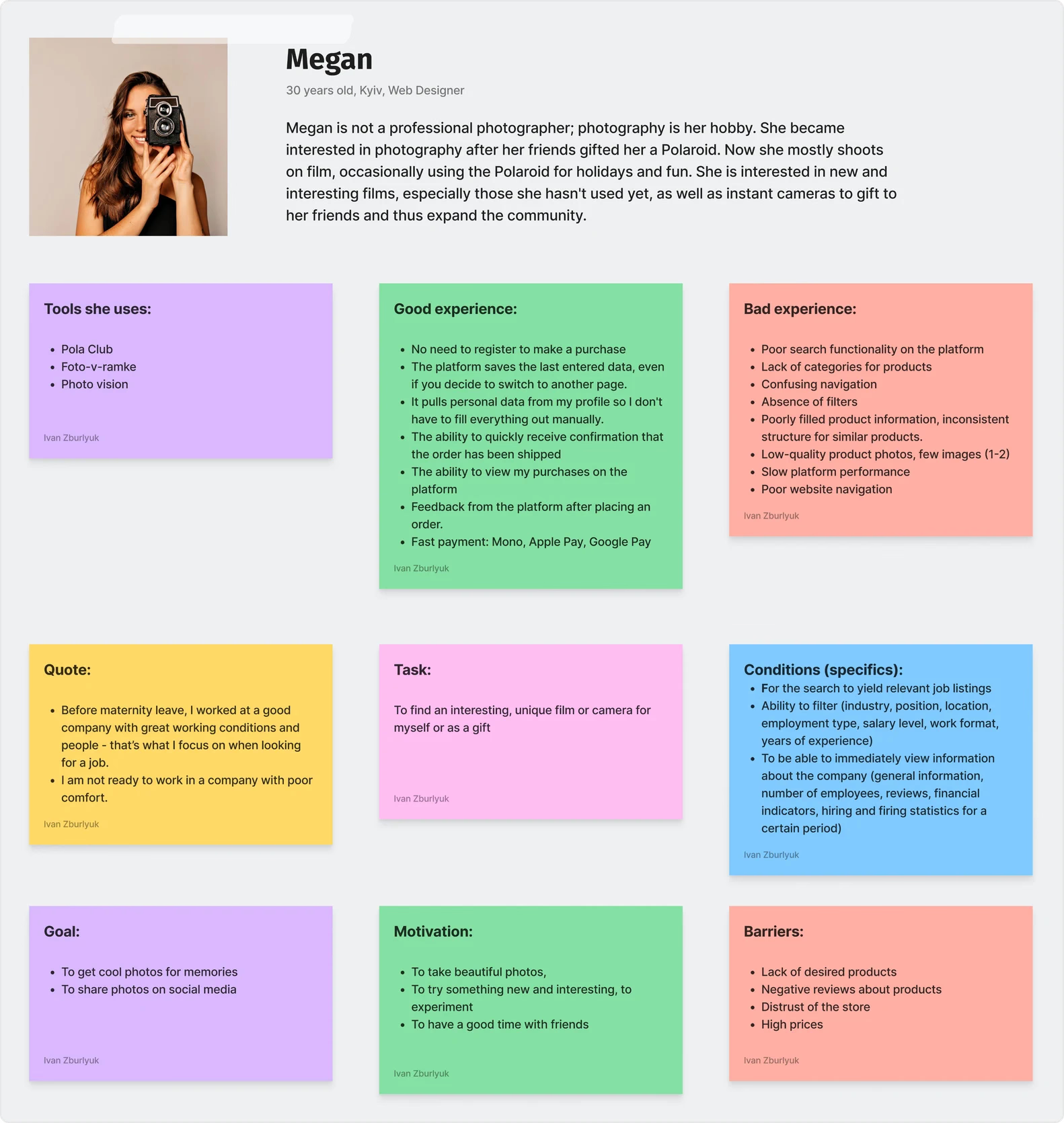
Raw data and interview transcripts can be hard for stakeholders to empathize with. By consolidating our qualitative insights into a primary persona, we shifted the team's focus from abstract "users" to a real human being. This aligned everyone on who we were designing for and made our strategic decisions much more user-centric.
Synthesizing our interview results, we introduced Megan, a hobbyist photographer. She loves the tangible, authentic nature of analog film but gets easily frustrated by technical jargon, confusing compatibility rules, and hidden costs.
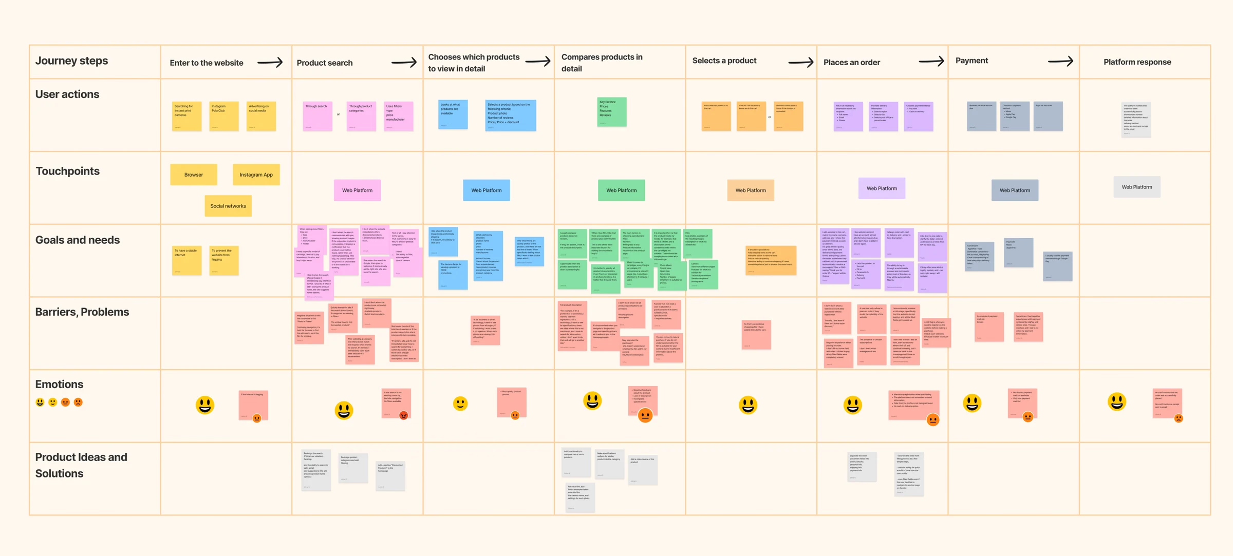
To visualize the scale of the problem, we mapped Megan's end-to-end journey from initial product discovery to final payment. The CJM clearly highlighted the exact moments of friction she faced at every step of the flow. It gave us a holistic picture of the platform's vulnerabilities—such as the cross-sell blind spots and checkout data-loss—allowing us to derive clear, targeted hypotheses for the redesign.
5. Formulating the Design Strategy & Hypotheses
After gaining a holistic view from the Customer Journey Map, our team didn't jump straight into drawing mockups. As a lead, it was critical for me to avoid "designing for the sake of design." We transformed every identified problem into a clear, measurable business hypothesis.
Hypothesis: Revamping Categories and Filters
If we redesign the product categories and implement sorting filters, then time spent on the site will increase, the user experience will improve, and purchases will grow by 10%, as users will find what they need much faster.
Because 8 out of 10 respondents complained about the difficulty of navigating between categories and the lack of quick filtering options.
How to measure: A/B testing
- Primary metric: Conversion rate (from category page views to add-to-cart).
- Secondary metric: Time to find a product.
- Segment: all users
Null hypothesis (H0):
Changing the category structure and adding filters will not increase the conversion rate.
Hypothesis: Logical Breakdown of the Checkout Form
If we logically divide the checkout process into steps, then checkout abandonment will decrease by 10% and the time taken to complete the form will be cut in half.
Because 9 out of 10 surveyed respondents often felt overwhelmed when all fields were grouped into one large block. A logical breakdown allows users to focus on information step-by-step, reducing the likelihood of errors.
How to measure: A/B testing
- Primary metric: Checkout Completion Rate.
- Secondary metric: Time to complete checkout.
- Segment: all users
Null hypothesis (H0):
Breaking the checkout form into logical steps will not reduce the number of abandoned carts.
Hypothesis: Product Comparison Feature
If we add a convenient product comparison feature to the site, then decision-making time will decrease by 20% and micro-conversions (add-to-cart) will increase by 5%.
Because 8 out of 10 users repeatedly mentioned that it is difficult to compare specifications and prices of different cameras without a dedicated tool, which delays the purchasing process.
How to measure: A/B testing
- Primary metric: Feature Adoption Rate.
- Secondary metric: Add-to-Cart Rate (among those who used the comparison feature).
- Segment: all users
Null hypothesis (H0):
Implementing a product comparison feature will not affect the conversion rate.
Hypothesis: Visible On-Site Search
If the search bar is persistently visible and accessible on the homepage, then search bar usage will increase by 25%, which in turn will boost overall conversion from the homepage by 8%.
Because 10 out of 10 respondents indicated that if they know exactly what they need, they immediately use the search function. A hidden search bar often goes unnoticed.
How to measure: A/B testing
- Primary metric: Search Usage Rate.
- Secondary metric: Search-to-Cart Conversion.
- Segment: all users
Null hypothesis (H0):
Changing the visual accessibility of the search bar will not affect overall conversion.
Hypothesis: "Discounted Items" Section
If we add a "Discounted Items" section to the homepage, then it will stimulate cross-selling and increase the Average Order Value by 10%.
Because 7 out of 10 users noted that discounts are a key factor when choosing a product, and they eagerly browse promotional offers for additional purchases.
How to measure: A/B testing
- Primary metric: Click-Through Rate (CTR) of the discounted items block.
- Secondary metric: Average Order Value.
- Segment: all users
Null hypothesis (H0):
Adding a promotional items block will not affect the average order value or overall revenue.
6. Pre-Design Validation: Quantitative Survey
Working in a startup environment or with limited resources often requires flexibility. Since we couldn't conduct A/B testing on a live site, I needed a quick and inexpensive mechanism to validate our hypotheses before the team spent time developing a prototype.
To minimize risks, we created a quantitative survey and distributed it among our target audience (particularly through the existing community). The survey results gave us a clear signal: users really needed a step-by-step checkout and comparison feature. This gave us the confidence ("green light") to move on to the high-fidelity mockup stage, knowing we were addressing the right problems.
Category navigation
What is more convenient for you
— when categories consist of different manufacturer pages (Polaroid, Instax)
— when there is a single "Photo Cameras" category page that includes manufacturers Polaroid and Instax with the option to filter by manufacturer?

- Categories of different product manufacturers’ pages11,9%
- One category page that includes all manufacturers with filtering options88,1%
Discount discovery
How often do you check the 'Discounted Items' section if it exists on the website?

- Never3,5%
- Almost never8,4%
- Rarely14,3%
- From time to time45,2%
- Always28,6%
Comparison usefulness
If yes, how useful was the "Product Comparison" feature to you?

- I don't understand how it works14,3%
- Not useful at all—
- Somewhat useful14,3%
- Useful52,4%
- Very useful14,3%
Search visibility
How do you prefer to use the search functionality on the website?

- Visible, immediately on the page92,9%
- Hidden, but accessible after clicking7,1%
Video reviews
Do you think a product video review will help make a purchasing decision?

- Not helpful at all—
- Probably not—
- Not sure21,4%
- Probably yes54,8%
- Very helpful23,8%
Comparison adoption
Do you use the "Product Comparison" feature on other websites?

- Yes61,9%
- No38,1%
Develop & Delivery
Prototyping, Usability Testing & Final Design
Equipped with our hypotheses, we developed a high-fidelity prototype and conducted a series of moderated user tests. My goal was not just to assess visual appeal, but to ensure that the new solutions genuinely alleviate cognitive load and address critical system errors. Below are the key interface transformations based on iterations after user testing:
Designed and tested, not shipped
1. Persistent Search Bar
During our initial usability testing, we observed a critical friction point: users who arrived with a specific product in mind were completely ignoring the search function. Because it was hidden behind a small, easily overlooked icon, buyers were forced to dig through frustrating category menus to find what they needed.
Solution: We moved the search bar to the header, making it constantly visible and accessible on every page of the platform and reworked the categories.

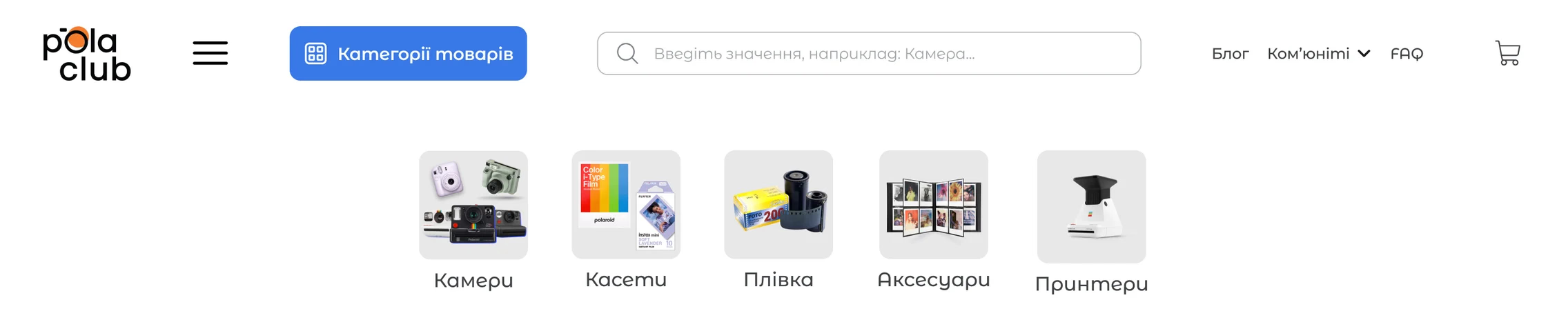


Insight from user tests: Users confirmed that this structure significantly speeds up the search. The constantly visible search bar completely removed friction for users who knew exactly what they were looking for.
Designed and tested, not shipped
2. Unified Categories & Advanced Filtering
Our initial research revealed a major architectural flaw: inventory was chaotically scattered across siloed brand categories (e.g., separate pages for Polaroid and Instax). This forced users to endlessly navigate back and forth, opening multiple browser tabs just to see what cameras were actually available.
Solution: I consolidated the fragmented architecture into a single, unified "Cameras" catalog. To prevent choice paralysis, I introduced robust lateral filtering—allowing users to instantly narrow their search by Brand, Price, Camera Model, Autofocus, In-Stock availability and Discount.
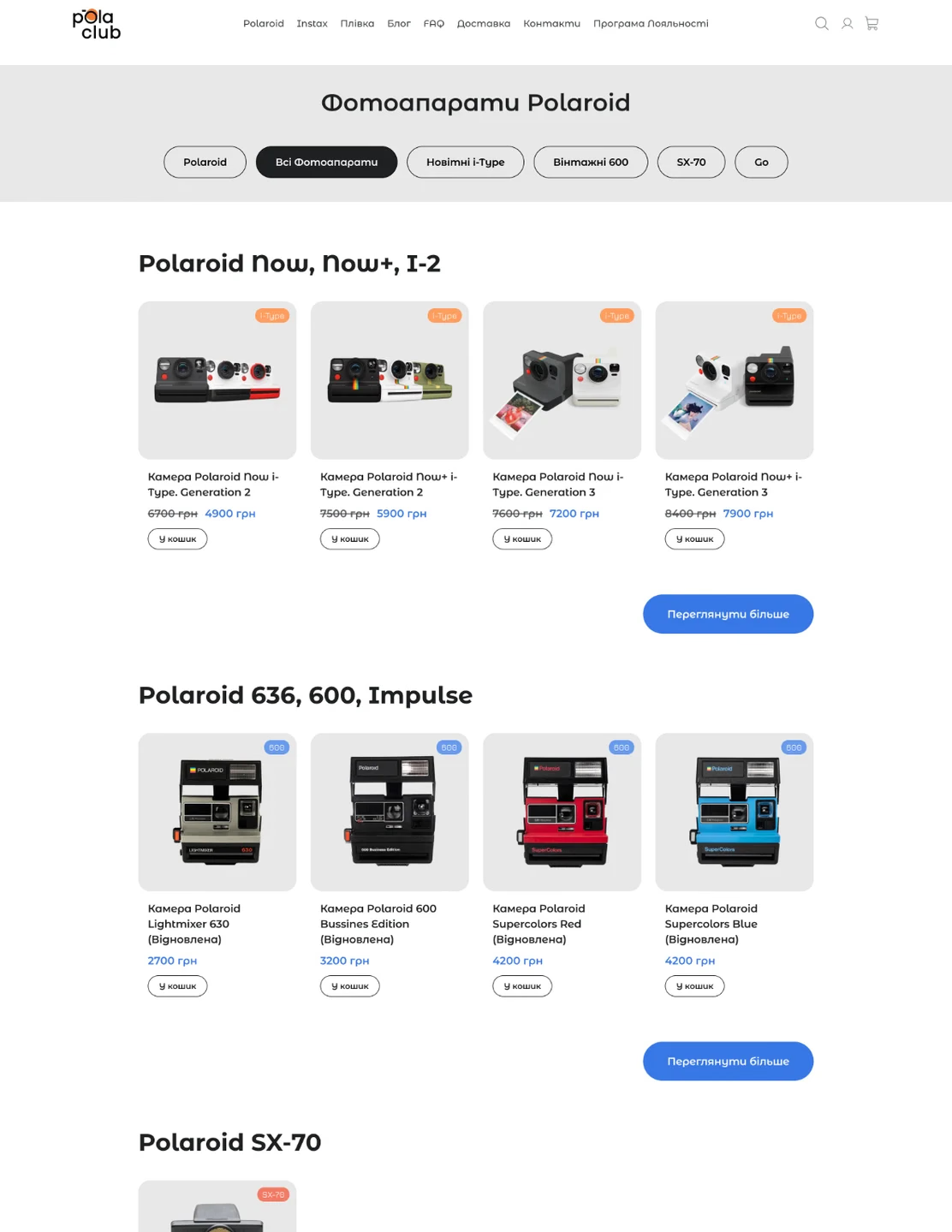
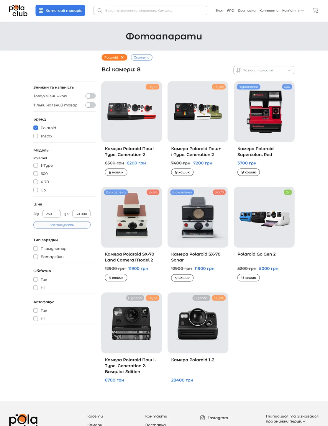


Insight from user tests: During our final usability testing, this proved to be our biggest win. The "aha" moment for users was profound: they could finally view the entire inventory in one place and instantly filter it down to their exact needs, completely eliminating the discovery friction that previously caused cart abandonment.
Product page shipped
3. Empowering Product Evaluation
Once users found a camera, they faced a major evaluation hurdle: legacy product pages lacked clear technical specifications and, most critically, failed to explain which film was compatible with which camera. They also lacked critical payment and delivery information, which eroded trust and halted the purchase process. If buyers weren't 100% confident the film would fit, they abandoned the purchase entirely to avoid making a costly mistake.
Solution: I redesigned the Product Detail Page to act as an educational tool rather than just a catalog entry. I standardized the technical specifications into an easily scannable format and introduced a dedicated, highly visible "Compatible Film & Accessories" cross-selling block.
Furthermore, we embedded video reviews directly on the page so users no longer had to leave the platform to research the product on YouTube.
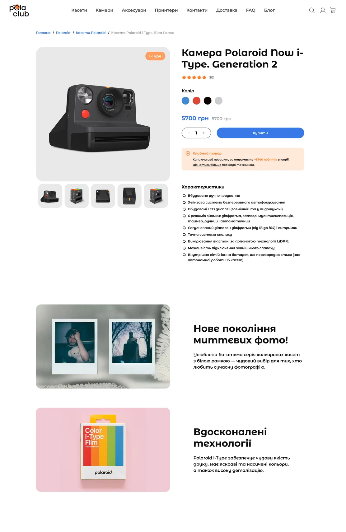
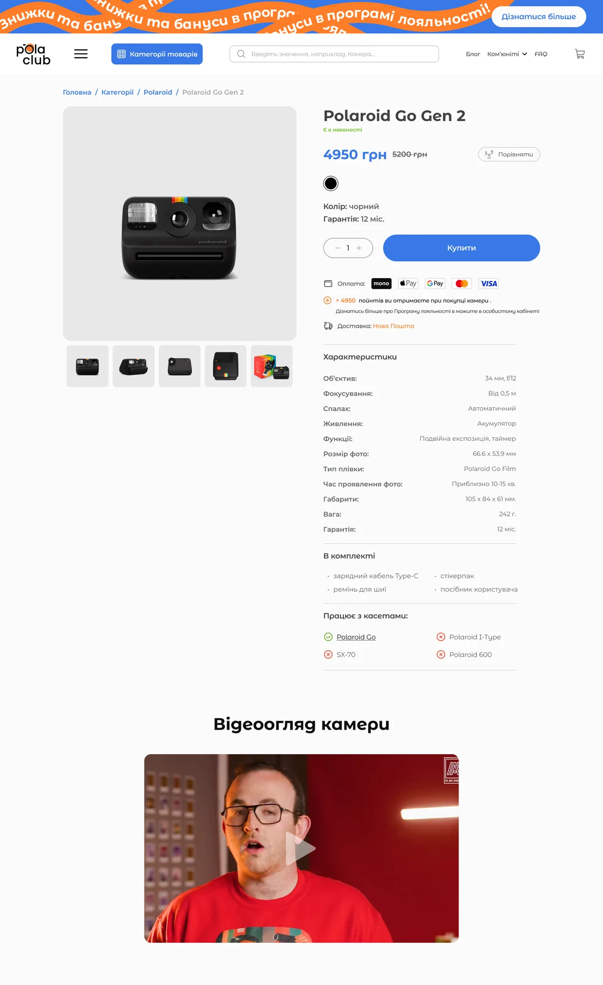

Insight from user tests: Users noted that clear features and visibly stated delivery and payment terms instantly alleviated their fears about placing an order. Integrated video reviews became a pleasant addition that reinforced the purchasing decision.
Designed and tested, not shipped
4. Product Comparison
While the new Product Detail Page improved individual product evaluation, users still struggled to weigh multiple options against each other. During testing, we uncovered a major misconception causing purchase hesitation: many casual buyers assumed all instant cameras used the exact same standard "square" film.
"Oh, this is cool! I thought every instant camera had a square-type format, but there are other types. This is very informative."
Solution: To actively educate buyers and prevent incompatible purchases, I introduced a dedicated Product Comparison tool. This allowed users to place cameras side-by-side and immediately spot critical differences in film type, camera size, and features. By clearing up these technical misconceptions, we gave users the total peace of mind they needed to confidently proceed to checkout.
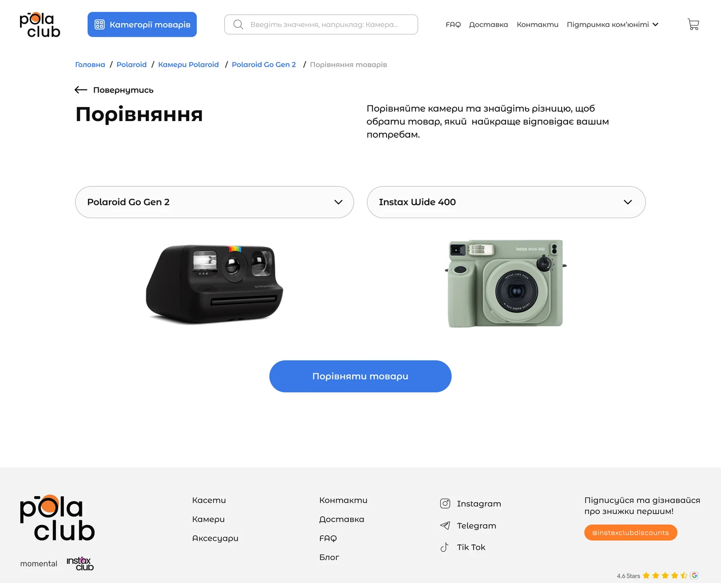
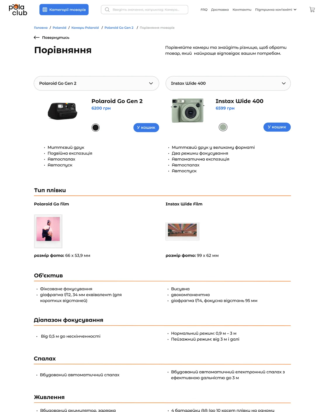
Insight from user tests: The comparison feature generated real excitement during testing. Users noted that they no longer needed to open a bunch of tabs, and the process of selecting a camera and making a purchase decision became much faster and clearer.
Checkout page shipped
5. A Frictionless Checkout Flow
The legacy checkout form was a massive cognitive overload, cramming every single input field into one chaotic block. Furthermore, our interviews revealed a major missed opportunity (for registered users): the platform's loyalty program offered a "1% discount," but this abstract number failed to motivate users because they couldn't visualize the actual savings.
Solution: To eliminate cognitive friction, I applied the principle of progressive disclosure, breaking the overwhelming form down into logical, bite-sized steps (Recipient → Delivery → Payment).
To psychologically motivate buyers to complete their purchase, I moved the loyalty bonus block to a pinned sidebar and redesigned the logic. Instead of displaying a vague percentage, the system now automatically calculates and displays the exact discount amount in real currency based on their cart total.
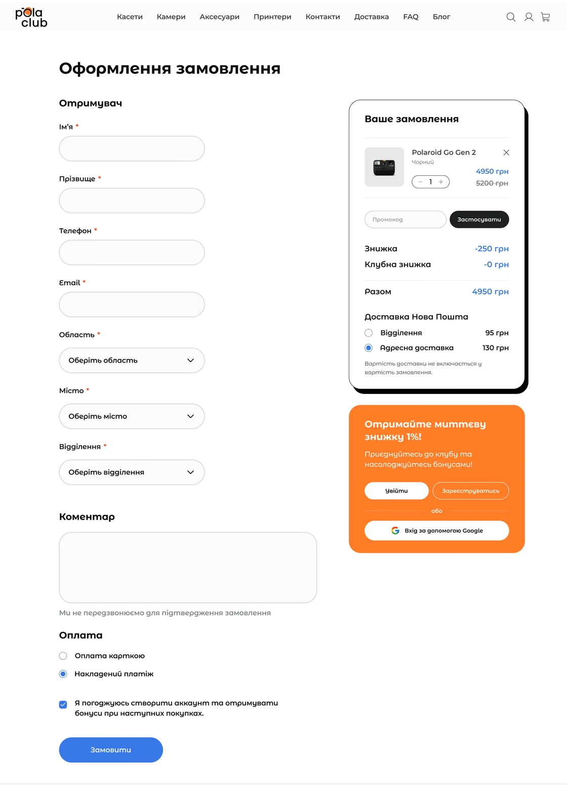
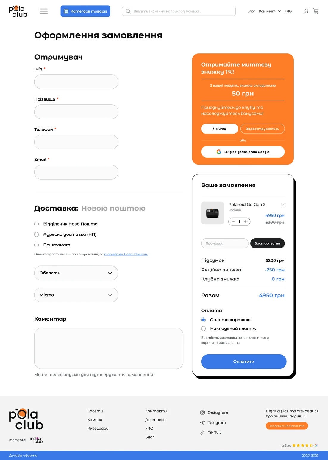

Insight from user tests: The step-by-step design instantly reduced cognitive load, allowing users to easily transition from one stage to the next thanks to the updated structure. However, the true driver was the transparency of the bonuses. The ability to see the exact amount of saved funds in monetary terms acted as a powerful trigger, completely eliminating doubts at the final payment step.
Error fixed
6. Eliminating Critical System Errors: The Checkout Bug
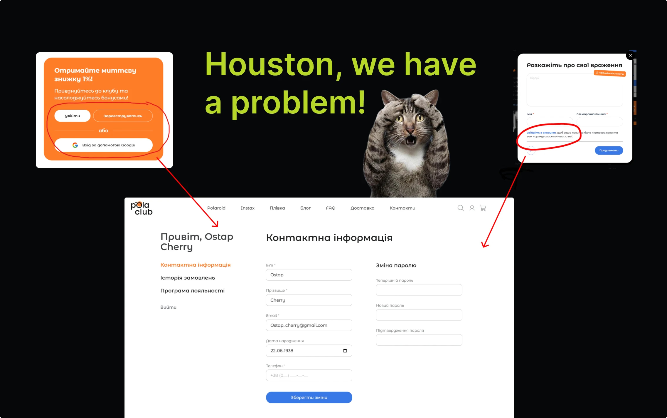
While my team focused on the findings, I conducted a manual heuristic walkthrough of the live platform to ensure our design solutions would actually survive the technical environment. During this audit, I uncovered a massive usability disaster that usability testing alone didn't catch: The Login-Redirection Bug.
The Login-Redirection Bug
If a high-intent buyer attempted to log in or register during the checkout process or leave a product comment (often to apply a loyalty discount), the system forcefully redirected them to their account profile page. Worse, when they navigated back to the cart, all of their previously entered shipping and payment data had been completely erased.
The Business Impact & Action
This wasn't just a minor UI glitch; it was a technical trap actively driving high-intent buyers away at the most critical moment in the funnel. I documented this critical flaw with visual annotations and flagged it in our final stakeholder report as a top-priority engineering fix.
By identifying this hidden technical leak and combining it with our logical UI restructuring, we protected the checkout funnel, which directly contributed to the overall 7% reduction in checkout abandonment.
Lessons Learned
This project was more than just a UI redesign; it was a crash course in team operations and cross-functional alignment. Reflecting on the 1-month sprint, my two biggest takeaways were:
- Structuring Teams: The greatest challenge wasn't the design itself, but organizing the workflow for three junior designers who had never worked together. By implementing a strict Kanban board and daily stand-ups, I learned how to rapidly align a new team, delegate effectively, and monitor execution to hit aggressive deadlines.
- Continuous Stakeholder Alignment: In hindsight, I saved our major research findings for the final presentation. If I were to do this again, I would flag critical user insights and involve key stakeholders right at the beginning of the process to ensure absolute strategic alignment from day one.
Next Steps & Strategic Recommendations
While we successfully streamlined the core buying journey, design is an ongoing process. Based on our user surveys and business goals, my strategic roadmap for the platform includes:
- Short-Term: Monitor the live analytics on the new checkout flow to ensure the login-redirection fix holds steady under high traffic.
- Long-Term: I recommended that all other findings and feature concepts (such as adding filters, changing categories, or a new comparison feature) be evaluated and prioritized based on long-term business goals and available development resources.